Wednesday, December 31, 2008

Logo: KZM Facial Care Boutique

This is probably my last post for the year. And it goes to Karley of KZM Facial Care Boutique. She had asked for a certain color scheme to match her web page's layout, which was designed by Boutique Mama. She's launching her own web site soon, and I can't wait to see it. Looks like her beauty products are really great -- i look forward to trying them out really soon (i'll probably post my experience with her Goat's Milk Face Cream) later in January after she reopens her shop. But here's her logo for the the top of her new web site. Thanks Karley, for the repeat business!

And here is a collection of the proofs I sent her prior to her final decision...

Happy New Year to All!!!!!!
Tuesday, December 23, 2008

HAPPY HOLIDAYS!!!


I am excited to take a couple days off to spend with the family up in the Los Angeles and OC areas. Looking forward to the food!

Merry Christmas to All!

Monogram Package: Jennifer and Tim


I loved working with Jennifer for her April wedding. Her wedding will be in one of my favorite color combinations: Sage and chocolate. So here are her final monogram choices. We will also be working on some table numbers for her too. Now it's time to choose which one of these will get to be on those table numbers. Hmmmm...

Monday, December 22, 2008

Kelly's Business Logo

Kelly came to me looking for a digital version of their business logo for MVP Commercial. It was a Roman temple, with some simple lines, so I decided to create it from scratch. I vectorized the temple (kinda tracing the original) and came up with the following. I kept the lines and colors simple because she will be using it to create an embroidered polo shirt, and letterheads. Hope the hubby likes it!

Marley and Me

So I found this great web site through Franklin Covey that creates cool avatars for you. You can add outfits and accessories. What sold me was that they had a SHELTIE to add to my avatar. I love my dog, so I'm definitely going to be signing up for this program. I was due to purchase the Jan '09 - Dec '09 organizer pages, and with the purchase of the GALS pages, you get a 90 day free access to their website to print your own notepages, to-do pages, and business cards with your personalized avatar. Plus it doesn't hurt that proceeds go to Breast Cancer. It's about that time for us to get our calendars for 2009, so why not make a difference while having a little fun with it? Check it out at Design Her Gals Web page.


Here is what I would look like just out and about with Marley (our 4 year old sheltie). And FYI, we got him before the wonderful novel came out.
This is what I look like when I go to work -- but I don't have Marley with me. I wish I could.

Friday, December 19, 2008

Real Weddings - Mexico

My friend Stacey just came back from a Cancun wedding and sent me a link to the photo slideshow. I was so impressed with the gorgeous receptions and photos, that I just had to post some of my faves. Destination weddings are so inspiring to me, because I LOVE the beach. I MISS the beach (we lived in Manhattan Beach, CA for 4 years before moving inland). Please enjoy some more of these beautiful shots by Elizabeth Medina -- if we decide to get married anywhere in Mexico, I'm definitely giving her a call. It's so nice to see that it is definitely possible for brides to have gorgeous receptions for their destination weddings -- it's amazing what these girls and venues have accomplished from such a far distance.

Thursday, December 18, 2008

Programs - A glimpse


Here's a sneak preview of a nearly completed wedding package for Jennifer (You can see her matching table numbers HERE). Her wedding is in January, so I have completed her multi-page booklets, in the smaller size. They measure about 4.25" X 5.5" folded, with 8 pages of text. Jenn actually took an interactive role in formatting how she wanted everything inside, including the font choices, which made my job sooo much easier. We are using Bazzil's Black Orchid cardstock for the dark purple/eggplant base color, then I used a sage green text cardstock for the trim, with off white linen paper for the text. I created a new monogram for the cover of the programs.
This is the general format I use for programs for brides that want to have more than 2 pages of text. But this smaller sized program is not only easy on the wallet, it's wayyyy cute.

Tuesday, December 16, 2008

Ann and Kyle Pretty In Pinks Part 5

Now I want to give Melissa Mclure Photography a shoutout for such gorgeous pictures. I want to share the few photos that she posted (her site is Melissa Mclure Photography) for Ann and Kyle's Pretty In Pink wedding in San Diego, CA. Check out the table setting! Those favor tags look familiar... wink wink.

I love seeing the products I create in action. It's such a wonderful feeling taking part in a client's special day...


Saturday, December 13, 2008

Jada B's personal Logo

Here is a personal logo I started to work on for Tanekeya's package, but unfortunately, we've scratched it and will be working on another. But, it turned out so cute, I thought I'd post it anyway. Jada is a makeup artist, which is why there is a blush brush in it.

Friday, December 12, 2008

Tristen B's Personal Monogram and Logo

This is just the first of a series of personal monograms/logos that I've created for Tanekeya Word, who by the way is an awesome artist. You can find her website at http://www.tanekeyaword.com/. Tanekya had sent me the peacock to use for the logo. I just had to tweak it a bit. The peacock image was created by a talented artist, Natalie, on her blog at http://www.definatalie.com/archives/31-Free-Vector-Shapes-Peacocks.html ...

Friday, December 5, 2008

Tori & Steve

I love that Tori knew exactly what she wanted in her monogram design. Once we knew which layout/design to use, it was just a matter of getting the right colors, and fonts for each element. Tori was such a doll for figuring out which fonts were her favorites, and finding the right color codes for her color pallette. Great job, Tori!

Personalized Notecard Sets

Here are my latest sets of personalized notecards that are intended to be Christmas gifts for 3 lucky ladies. I LOVE the letter Q on these cards. There need to be more names with Q so I can make more of these...


Thursday, December 4, 2008

Ann and Kyle Pretty In Pinks Part 4

Anne sent me the link to her photographer's blog with their wedding photos: Kyle and Ann - The Prado at Balboa Park » Melissa McClure Blog. This past Saturday, Kyle and Ann got married at The Prado, a gorgeous venue in San Diego's Balboa Park. Luckily it didn't rain that day, since it was raining a few days before. Check out the photographer's blog and see Ann's slideshow -- if you wait a bit, you will see some of my work in the slide show (I did their programs, favor tags, placecards and table numbers!). But as an added treat, see how beautifully shot the day was by Melissa McClure Photography. Her work is probably one of my local favorites. I'm pretty new to the San Diego area, so I look forward to discovering the talent around here.

Saturday, November 29, 2008

Happy Birthday Marlene!

Yet another unique personalized birthday card for Angel, a repeat customer! Since the birthday girl's invites were a dark red, I used the Bazzil Bling cardstock for her 15th birthday card, and accented it with the daisies. Nothing like a personalized birthday card. Happy Sweet 15, Marlene!

Christina and Alexis -- Destination: Hawaii!

Another destination wedding! Tina is getting married in Hawaii early next year and wanted to name each table after different cities and islands in Hawaii. Her color is Turquoise, and we used chocolate shimmer as the base. Aloha and Congrats, Christina and Alexis!


With this set, I had made the ribbons too long (accidentally), so when I tied the bow, it came out looking like this below, hanging towards the bottom as opposed to my usual "straight up" to the side, but I thought this looked so cute, I will be using this style for all my future flat table numbers... They are easily changeable to lay to the side if you want... As soon as I find a vendor, I will be adding little easels to my inventory, so that brides can purchase them directly from me to avoid the hassle of finding them on their own, or having their venue provide them...

Thursday, November 27, 2008

HOLIDAY SALE this Weekend!!

I'm having a sale on my Personal Notecard Sets This Friday through Sunday! Buy any one set and receive an extra 2 notecards FREE!!!! Visit my shop at http://www.gedesigns.etsy.com/ and make your purchase! Spend more than $30 (on greeting cards & notecards), and receive FREE SHIPPING!!!!

This is Marley, GE Designs' mascot. Happy Thanksgiving!!!!!

Tuesday, November 25, 2008

Karen's Wedding: Chicago meets NY

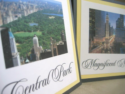
Karen will be having a destination wedding in Florida, but wanted to create a theme for her guests that came from all over the country. Karen and her fiance are from Chicago and New York, so she wanted to use landmarks from each city to bring them together in the reception...


Karen will have the card below at her candy buffet table...


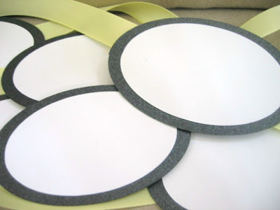
And she asked for 14 large oval tags to hang on the candy jars as labels. She opted to fill in the candy names herself. These measure at 3.5" x 1.5 ".


Karen's feedback (from etsy): "A+++ seller! So easy and pleasant to work with! The table names and candy buffet sign turned out perfect - love it! They will be awesome for my wedding. Thanks again Giselle!"

Monday, November 24, 2008

Ann and Kyle: Pretty In Pinks Part 3

Here are Ann's Programs! Actually, I'm still working on getting the last of these put together. We're down to the wire, but I WILL have these done by tomorrow, I know it! I just had time this morning to take pics of a stack of them for Ann to see their progress. These are the LARGE booklet style programs that hold 3 folded pages, which means she has 12 pages of text (the last page has their picture). The large booklets measure at 8.5" X 5.5" (half page letter page). Ann opted to use a photo of her and Kyle for the front cover instead of a monogram (which I usually do) or names. The text is printed in black on linen cream paper. I always try to use this type of paper for the programs, because I feel like linen give it a more elegant touch.


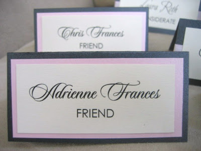
And here are her placecards. I had sent her 3 designs in a sample packet, and she liked them all so much, she decided to use all three. So we have the dual cardstock look, and two ribbon variations.


Friday, November 21, 2008

Ann and Kyle: Pretty In Pinks Part 2

The next phase of Ann and Kyle's wedding package, are their table numbers and their seating chart. Ann and her mom came up with the unique theme of using WORDS that describe relationships & marriage, then including their dictionary meanings underneath. Soooo cute.


Here is the picture of Ann's Seating Chart. I created this for her and sent her the pdf file to be printed in both 11X17 and 26 X 30 sizes. She'll be taking it to her local printer to print and display.