
Sunday, October 31, 2010
Jaime + Steven
Jaime came up with a really cute idea for her table cards. She and her fiance decided to personalize each card with a song title, phrase, and other important aspects of their lives. We inserted an official definition, and why it is important to them as a couple. Cute little things were said about each of them on each card. Love it!

Saturday, October 30, 2010
Porsche + Timothy's Baby Shower
Porsche + Timothy had a baby shower last weekend, and here are some signs we made for the new family! Signs for the candy cafe, cake table, and gift table were actually 8x8 cards, with the kickstand option to stand on its own.

Thursday, October 28, 2010
GE Wedding: A Musical Dilemma
I'm torn over the music for our Cancun wedding ceremony and reception. As of today, there are less than 10 guests booked (woo hoo!), which means that our reception dinner is going to be pretty tiny. Is it necessary for me to spend $800-1200 on a Cancun-based DJ to entertain less than a dozen people at dinner?
I've gotten mixed reviews from my guests. Some expect dancing, some don't expect such a small group to have a dance floor. It's just our parents, siblings, a few friends... hmmmm. I worry more about guests being bored, but really, how can one be bored with a dinner on a gorgeous terrace overlooking the Pacific Ocean?
The alternative to a DJ would be to have our iPod playing in the background. Not bad. Just means that we'll have to come up with a good list of songs to play for 3 hours or more. Is that ghetto? I've never been to a wedding where there wasn't a band or DJ, but then again, I've never been to a destination wedding.. Unless we win the Lottery between now and January, I think we'll be leaning towards the iPod thing. Just need to compile a list of cool songs, and categorize them so that my wedding coordinator just needs to click play.
Now for the songs... any ideas? hmmmm. Updates later...
Elizabeth Medina Photography: Blog Love
It's been a couple months since I've browsed some of my favorite Cancun photographers' blogs. Elizabeth Medina posted some gorgeous photos in the last few months. Here's a glimpse of a recent entry where the colors were soooo beachy and bright (for all you beach brides). LOVE it. It makes me glad that I've added a few orange pieces to my summer wardrobe this year, so that I have some bright pieces to wear on our own wedding trip to Cancun. Again, I am obsessed with Elizabeth's work, and I wish she was available for us, but I can only admire from afar (on my computer screen)...


Wednesday, October 27, 2010
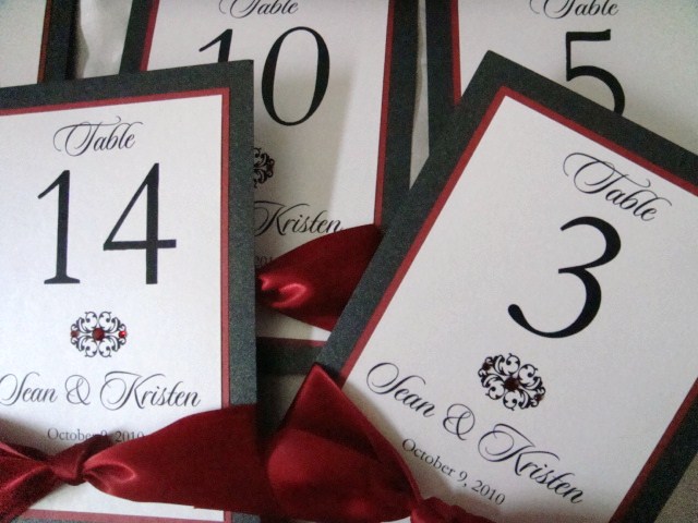
Red & Black
Here are some recent orders in red and black. For some reason, red was used a lot in weddings this month. Plus I'll be using crimson red in my own wedding this January, so maybe that's why I'm seeing red. I was messing around with some photos of table card orders from this month, and posted the photo below in a listing. :)


Monday, October 25, 2010

Saturday, October 23, 2010
Jennifer and Ryan's Wedding Suite
Here's one of my favorite color combinations of silver and plum. Jennifer had a set of tented table cards, tented menus (2 per table), signs and programs.


Wednesday, October 20, 2010


Monday, October 18, 2010


Wednesday, October 13, 2010
Katie + Chip
Here's a rush order that turned out to be a new custom design for Katie and Chip's wedding this weekend... We finished this in record time -- 36 Hours! How did people function without emails and blackberries 10 years ago???
 Katie had originally asked for the Swirly Design in my shop, but it kinda morphed into this design when she asked for a touch of shamrocks.

Tuesday, October 12, 2010
Introducing the ANNA Invitation Suite
I've been feeling that my shop needs more wedding invitations. I don't know why it took me 2 years to move forward with that. So here is my latest addition to my wedding invitation collection.


Colors available:
[Cardstock]


The ANNA collection features a pretty cool Damask/Flourish/Swirly design that I've used for my Swirly Seating Chart. This design can be applied to any other wedding stationery -- table numbers (samples coming soon!), menus, placecards, thank you cards, etc. I wish the photographs showed that the top white layer is a beautiful heavyweight metallic cardstock with shimmer (I did my best to take photos at different angles). There is also a Quartz version that is off white and more shimmery than the Crystal white metallic cardstock.

With this collection, the pop of bling and color is in the rhinestones. Keep it simple and elegant -- that's my motto. Available at GE Designs on Etsy.

Colors available:
[Cardstock]
- Chocolate
- Black
- Pewter/Steel Gray
- Silver
- White
- Pearl
- Ivory
- Green
- Plum
- Lavendar
- Light Blue
- Tiffany Blue
- Navy
- Light Pink
- Fuschia/Bright Pink
- Copper/Burnt Orange
- Clear
- Red
- Aqua
- Green
- Pewter
- Cobalt Blue
- Pink
- Fuschia
- Lavendar
- Purple

Monday, October 11, 2010


Sunday, October 10, 2010
Laurie + Matthew's Wedding Suite
Laurie and Matthew got married this weekend! Laurie was so great to work with! Here's a peak at their suite of programs, placecards and reserved signs...


Saturday, October 9, 2010
Introducing the MICHELLE Invitation
I have a new collection of designs the MICHELLE Invitation Set.
 This new collection of invitations includes
-One 5x7 Panel Invitation
-One coordinating RSVP Card
-One A7 Euroflap White Envelope
-One RSVP White Envelope


 You may insert the RSVP Card under the 1.5 inch satin ribbon on the back of the invitation panel for a nice tight package.


-One 5x7 Panel Invitation
-One coordinating RSVP Card
-One A7 Euroflap White Envelope
-One RSVP White Envelope
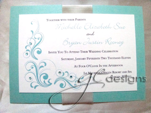

Each panel invitation uses heavy #105 metallic cardstock, depending on the colors that are requested. Each scroll design comes in customized colors. Adorned with 5 handplaced HotFix rhinestone crystals in the flourishes. Even the RSVP Card has a crystal to match.


Friday, October 8, 2010
Lauren + Dallas Table Cards
I'm always a fan of using Significant Years in table number cards. Great way for the guests to get to know the couple a little better... Congratulations, Lauren & Dallas!!!


Thursday, October 7, 2010
Linette + Barron
Linette and Barron went for the theme of significant locations.


 |
| A custom monogram created for their pieces |


 |
| One card for the bar to name their signature drink for the evening... |
Wednesday, October 6, 2010
Geanelle's Seating Chart
We custom designed Geanelle's seating chart design and monogram. Not too shabby. Try imagining this printed and displayed in a gold frame. Pretty...


Tuesday, October 5, 2010
Melissa's PRISCILLA Programs
Melissa ordered Purple and antique gold programs for her wedding. Since there is limited space in the PRISCILLA Program design, Melissa added an optional "Thank You" piece on the back cover, so that she and her husband may share their personalized message for their guests.


Monday, October 4, 2010

Sunday, October 3, 2010
Marcella's Wedding Suite
Here's a glimpse at the Suite of wedding stationery Marcella ordered for her wedding this weekend!

Saturday, October 2, 2010
SEATING CHART DESIGN - CHALKBOARD
A prospective client pitched this idea to me, so I thought, that's a cute idea! I welcome all new ideas and love attempting new designs. I finally found the right fonts and graphics, and posted this chart design for purchase in my shop! As always, all colors are custom. I would suggest keeping the font style and dark backgrounds, so that it keeps that "chalkboard" look. So if your reception theme is rustic elegance, this design would look so perfect in a worn wooden frame, or mounted on a foam board on a wooden easel.


Subscribe to:
Posts (Atom)